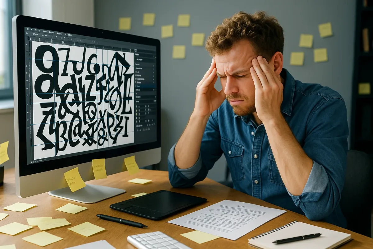
If you’ve been online today, you may have seen people sharing hilarious design fails from the article “People Are Sharing Design Examples That Show How Important Proper Spacing Really Is.” Those screenshots are funny—until it’s your own PC or laptop rendering text so badly that menus are unreadable, websites look “off,” or documents print with broken spacing and overlapping letters.
Behind those jokes is a real, very current computer problem: font handling, kerning, and spacing bugs on Windows and macOS, especially after recent OS and browser updates. Bad fonts can make UIs unusable, PDFs illegible, and websites look completely different from what designers intended.
This guide walks through five practical, technical fixes to solve spacing and kerning issues on your own machine so your text stops looking “cursed” and starts looking clean and professional again.
1. Diagnose Whether It’s the App, the Font, or the OS
Before changing settings randomly, you need to isolate where the problem lives: in one app, one font, or your entire system.
Check multiple apps
- Open a browser, a text editor (Notepad / TextEdit), a PDF viewer, and maybe Word or LibreOffice. - Use the same text (copy‑paste a paragraph of lorem ipsum or any article). - If spacing/kerning is broken only in one app (e.g., Chrome but not Edge), it’s likely an app or rendering engine issue. - If it’s broken system‑wide, suspect fonts or OS-level text rendering.
Check multiple fonts
- In a text editor or Word, type a test line: AVATAR Water WAVE ffi fi fl 1234567890 - Switch between built‑in fonts: Segoe UI, Arial, Calibri, Times New Roman, SF Pro (macOS), etc. - If only one or two fonts look broken, you’re dealing with corrupt or malformed font files. - If all fonts have weird spacing, suspect font cache or display scaling.
Check multiple websites
- Visit a few sites that use different font stacks: - A news site (NYTimes, BBC) - A developer site (GitHub) - A documentation site (MDN, Microsoft Learn) - If only some sites look broken, it may be: - A web font load issue (e.g., a failed Google Fonts download) - A recent browser update that changed font rendering
This quick triage tells you where to focus: the browser, the OS, or specific fonts.
2. Reset and Rebuild the Font Cache (Windows & macOS)
A very common root cause of “cursed text” is a corrupted or stale font cache. Both Windows and macOS keep internal font databases to speed up rendering. When those caches go bad—often after updates, sudden shutdowns, or font installs—you get random spacing and kerning glitches.
Windows 10 / 11: Rebuild Font Cache
Stop the font cache services
- Press Win + R, type services.msc, press Enter. - Locate: - Windows Font Cache Service - Windows Presentation Foundation Font Cache 3.0.0.0 (if present) - Right‑click each → Stop.
Delete font cache files
- Open File Explorer and go to: - C:\Windows\ServiceProfiles\LocalService\AppData\Local\FontCache - Delete all FontCache*.dat files. - Also go to: - C:\Windows\ServiceProfiles\LocalService\AppData\Local - If there is a ~FontCache folder, delete it.
Restart font services
- Back in services.msc, right‑click the same services → Start. - Alternatively, restart your PC (this will recreate the cache automatically).
Test your apps again
- Open the applications that had problems and recheck text rendering. - If everything is back to normal, the cache was the issue.
macOS (Monterey, Ventura, Sonoma): Clear Font Caches
Apple’s text engine (Core Text) can also get stuck with wrong metrics or corrupted caches, especially if you sync fonts via iCloud, Adobe, or third‑party managers.
Boot into Safe Mode (cleans some caches automatically)
- Intel Macs: - Restart, hold Shift immediately after the chime, release at login screen. - Apple Silicon (M1/M2/M3): - Shut down. Press and hold the power button until “Loading startup options” appears. - Choose your disk → hold Shift → click Continue in Safe Mode. - Log in, wait a couple minutes, then restart normally.
Use Terminal to reset user font cache (optional advanced step)
- Open Terminal and run: ``bash atsutil databases -remove atsutil server -shutdown atsutil server -ping ` - Log out and back in, then test rendering in multiple apps.
After this, many font-spacing issues—especially ones seen after recent macOS updates—resolve without touching individual fonts.
3. Remove or Fix Problematic Fonts (Including Downloaded Web Fonts)
Viral posts about bad kerning highlight a very real issue: a single bad font can corrupt the look of a whole interface. This often happens when:
- You’ve installed free fonts from random sites.
- A web font was cached locally and is being preferred over a system font.
- A corporate or design tool (e.g., Adobe, Figma) installed custom fonts that override defaults.
Windows: Reset to Default Fonts and Remove Suspects
Reset system fonts to default
- Go to Settings → Personalization → Fonts. - On the right, click Font settings (or search “Font settings” from Start). - Click Restore default font settings. - Reboot and test again.
Identify recently added fonts
- In Settings → Personalization → Fonts, scroll through and look for: - Recently installed custom fonts - Duplicates with slightly different names - For each suspect font: click it → click Uninstall. - Restart the affected app after removals.
Check for duplicate font families
- Having multiple versions of the same family (e.g., several “Roboto” or “Open Sans” variants from different sources) can confuse layout engines. - Keep only one clean, known-good version (usually the official download from Google Fonts, Adobe, or the OS).
macOS: Disable or Remove Problem Fonts via Font Book
Open Font Book
- Go to Applications → Font Book.
Validate fonts
- Select All Fonts. - In the menu: File → Validate Fonts. - Look for yellow or red warnings. - Right‑click problematic fonts → Disable “FontName” or Remove “FontName”.
Check for duplicates
- In Font Book: Edit → Look for Enabled Duplicates. - Resolve conflicts by keeping only the system or trusted version.
After cleaning up, restart affected apps (or the entire machine) and re‑test. Design tools like Figma, Sketch, and Adobe apps are particularly sensitive to bad fonts, and clearing them often fixes bizarre rendering.
4. Fix Scaling, DPI, and Browser Rendering Glitches
Some of the “cursed UI” screenshots that go viral aren’t caused by fonts at all—they’re caused by DPI scaling and GPU rendering bugs, especially after recent GPU driver or browser updates (Chrome, Edge, Firefox, and Chromium-based apps like Discord or Slack).
Adjust Windows Scaling and Clear Browser Overrides
Standardize display scaling
- Right‑click Desktop → Display settings. - Under Scale, set to 100% or 125% for troubleshooting. - If you have multiple monitors with different scaling (e.g., 150% on laptop, 100% on external), try temporarily aligning them (both at 100%) to see if that resolves spacing glitches.
Disable browser hardware acceleration (test)
- In Chrome / Edge / Brave / Opera: - Go to chrome://settings/system (or equivalent). - Turn off Use hardware acceleration when available. - Restart the browser. - If fonts render correctly with acceleration off, you may have a GPU driver or browser rendering bug.
Reset browser font settings
- Chrome / Edge: - Go to chrome://settings/fonts. - Click Customize fonts → click Reset to default (or manually set standard fonts back to defaults like Arial / Times New Roman). - Disable any “Force custom fonts” or accessibility extensions that override fonts.
Force clear browser cache for web fonts
- Open DevTools (F12 or Ctrl+Shift+I). - Go to Network tab → check Disable cache. - Hard-refresh the page (Ctrl+F5). - If the site uses Google Fonts or similar, you should see fresh .woff2 downloads. Corrupted or partial web font caches are sometimes the culprit.
macOS: Font Smoothing and Display Settings
Toggle font smoothing
- System Settings → Displays. - Try adjusting Resolution to Default instead of scaled. - In older macOS versions, System Preferences → General → Use font smoothing can change kerning/antialiasing appearance.
Browser-specific flags (advanced)
- In Chrome-based browsers, flags like #lcd-text-aa (LCD text antialiasing) or GPU compositing flags can modify rendering. - Only tweak these if you know what you’re doing; otherwise, click Reset all in chrome://flags.
This class of fixes is especially relevant right now because recent browser/driver updates have introduced font glitches for some users—if you suddenly saw weird spacing after a GPU or browser update, suspect rendering before fonts.
5. Export, Print, and Share Text Safely (PDF & Web Best Practices)
Those viral examples of disastrous spacing often come from exported or printed content, where the system had to interpret fonts differently than on-screen. To avoid becoming the next screenshot on social media, make sure you’re embedding and exporting text safely.
For Office Documents (Word, PowerPoint, LibreOffice)
Embed fonts on export
- Microsoft Word (Windows): - File → Options → Save. - Enable Embed fonts in the file. - Prefer Embed only the characters used in the document if file size matters. - This reduces the risk that another viewer’s machine substitutes a different font with different metrics, which often causes nasty line breaks and spacing shifts.
Use robust, well-tested fonts
- Stick to core families like Calibri, Arial, Times New Roman, Roboto, Noto, Segoe UI unless you have a reason not to. - Exotic free fonts from random sites are much more likely to have incorrect kerning tables or broken hinting.
For Designers and Developers (Figma, Adobe, Web)
Test without custom fonts
- In dev tools, temporarily override fonts to a system default stack (e.g., system-ui, -apple-system, BlinkMacSystemFont, "Segoe UI", sans-serif). - If the layout looks normal, your custom web font is the issue (bad file, bad subset, or wrong metrics).
Serve modern formats and correct CSS
- Prefer WOFF2 for web and ensure your @font-face declarations include: - Proper font-weight and font-style - Matching font-display (e.g., swap`) - Mismatched style/weight declarations can cause browsers to “fake” bold/italics, which shifts metrics and spacing.
Proof PDFs on multiple viewers
- Check your exported PDF in at least: - Adobe Acrobat Reader - Browser-integrated viewer (Chrome/Edge) - If one viewer shows strange spacing, adjust your export settings (embed fonts, change compatibility level, or re-flatten text) and try again.
By controlling how fonts are embedded and consumed, you avoid the real-world equivalent of those viral bad-kerning screenshots—especially important if you’re sending resumes, pitch decks, or client deliverables right now.
Conclusion
The surge of posts mocking bad spacing and kerning is a reminder of how fragile text rendering really is. Between OS font caches, browser rendering engines, GPU drivers, and thousands of available fonts, it doesn’t take much for your own system to start producing “cursed” text.
To recap the most effective steps:
- Isolate the problem: app vs. font vs. OS.
- Rebuild font caches in Windows or macOS.
- Remove or disable problematic fonts and duplicates.
- Tame scaling and GPU rendering to avoid DPI and driver-related glitches.
- Embed and export fonts correctly so your documents and websites look right everywhere.
If you’re still seeing weird spacing after trying these, tell me your OS, affected apps, and a screenshot description of what the text looks like (overlapping, too wide, random gaps, etc.), and I can walk you through deeper, case-specific diagnostics.
Key Takeaway
The most important thing to remember from this article is that this information can change how you think about Computer Problems.